

Exploring the Colour Wheel
What is a Colour Wheel?
A colour wheel is simply…
“a circle with different coloured sectors used to show the relationship between colours”
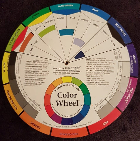
Above is an example of a standard colour wheel you can buy them large around 9" or as a pocket size one around 6" they are useful when planning a painting. Do you want to use complementary colours or maybe a colour scheme... what happens if you add white to a colour and they even help with colour mixing.
But... there is nothing that beats your understanding of colour than mixing your own colour wheels. When you mix your own you will be using the primaries in your own box. Try choosing three primaries and see how many colours you can mix in a classic colour wheel.
However, when you mix I like to understand why two primaries mix more dull and others bright so to my favourite colour wheel... the leaning colour wheel. It is when showing people this wheel for the first time that you see a ‘light bulb’ moment – suddenly it starts to make sense. This will help you to know how to mix colour – we will cover colour mixing in another blog. But before I describe a colour wheel that leans lets talk about warm and cool colour.
Warm or Cool Colour
So would you describe a colour as warm or cool? Almost everyone agrees that certain colours give a feeling of warmth, red, orange and yellow are seen as colours on the warm side of the colour wheel whereas green, blue and purple are described as cool.
Colours are relative to those that are next to them and this is where we get differences of opinion. Not all colours are created equal so a red that leans towards yellow (an orange-red) could be described as warmer than a red leaning towards blue (a purple-red). Yellow is reasonably simple as well. However, what about Blue – Is a blue-green cooler or warmer than a blue-purple? – this is not so simple. Everyone has a different opinion, if you are interested in the history and science behind colour and anything you wish to know about colour theory handprint is a fantastic online resource, here it goes into warm vs. cool.
Colours that Lean
When I talk about a colour that leans I am referring to which other colours they lean towards. Process colours are the primaries that a printer uses: cyan, yellow, magenta (they also use black). With these colours in theory any colour can be produced.
But paint pigment generally leans more one way than the other. It certainly does relative to other paints as all colours sit somewhere within the colour wheel. A primary colour is a colour that can not be mixed, in paint these colours are red, yellow and blue, if you add all three of these colours together in theory you will get black (NB a light colour wheel is different, all colours added together make white light and a prism will split out the colours - but lets get back to paint!).
Primaries
Red
Lets take two paint colours: cadmium red and alizarin crimson. These are common paint colours often used. Cadmium red leans towards yellow and will make a bright orange; alizarin crimson leans towards blue and will make a brighter purple. I often use Permanent Rose as a primary - beautiful purples, it definitely leans to blue.
Blue
With blue lets take Ultramarine (red leaning) compared with Pthalo Blue (green leaning). Just to confuse in professional acrylics you can get the same colour in with different leanings e.g. Liquitex has an Ultramarine (Red Shade) or Ultramarine (Green Shade) so it is all relative!
Yellow
Finally lets take cadmium yellow (red leaning) and lemon yellow (green leaning).
A Colour Leaning Wheel
 A Leaning Colour Wheel with Two of Each Primary – Red, Yellow and Blue
How to Create Your Own Colour Wheel
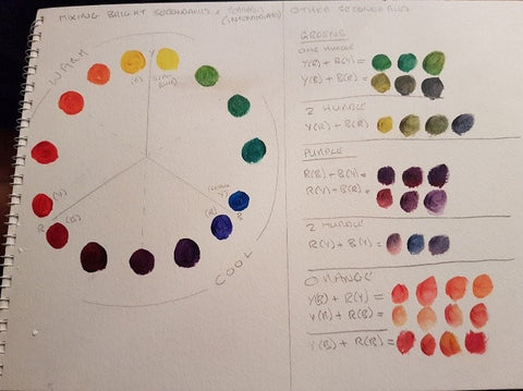
To start your Colour Wheel draw a circle split into three or even just three lines without the circle. With the yellow at the top I have painted the cadmium yellow on the side of the line that leans towards red whilst the lemon yellow is on the side of the line leaning towards blue. The cadmium red is leaning towards the yellow and the alizarin crimson is on the side of the line that leans towards blue. Ultramarine on the red side, pthalo blue on the yellow side. Once you have done this, as you can see in this diagram I have started to mix greens and then purples but only those that lean towards each other. None of the colours mixed here have ‘crossed’ a line, they lean towards each other and hence will be bright.
A Leaning Colour Wheel with Two of Each Primary
After mixing all of these colours you can then move on to crossing the lines. In nature not all colours are bright and it is often better to mix a green that crosses the line i.e. mixing a blue with a yellow that leans red and hence a touch of red. By introducing red the colour is dulled and when painting this is something that needs to be considered depending on what is being painted. Some examples of colour mixes that are dulled are found on the side of the colour wheel. Try it for yourself!
I hope you have enjoyed this blog, our next one will explore colour even further. Contact me with any queries or if you want to join my on-line class.