

Photo by Sharon McCutcheon from Pexels
What are Secondary Colours?
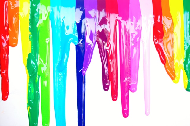
Secondary colours are simply two primaries mixed together. So green, orange and purple are all secondaries.
In the first blog in this colour series we found out how to use the colour wheel and started to mix the primaries together. We noted that if colours lean towards each other they would mix brighter than if they leaned away. Hence if you have a Blue that leans towards Yellow and a Yellow that leans towards Blue a bright green is produced. A more natural green such as that which occurs in nature tends to be muted. So a Blue that leans towards the Red (say ultramarine) will make a more muted green because there is a touch of Red in this Blue so when mixed with Yellow you produce a Green that is duller as it contains all three primaries.
So if it is a dull Green is this a Secondary colour or a Tertiary? Hmmm… lets start with some definitions from the Cambridge Dictionary, lets go back to primaries:
Primary Colour – Definition
‘one of the three colours, red, yellow, and blue, that can be mixed together in different ways to make any other colour’
I would take it further than this and state that they can not be made by another colour. Also it is interesting to note that true primary colours are cyan, magenta and yellow. These are the pigments that are used in the printing industry, the ones you find in your Ink Jet Printers and together with black they form other colours. The reality is we as artists don’t use only three primaries although you can buy process cyan, magenta and yellow i.e. the colours found in Ink Jet printers if you want to.
So why have I got all these reds, blues and yellows... which one should I use????
Think in terms of colour leaning, it simplifies our understanding and believe me colour theory can get complex! Primaries are not all equal...
Secondary Colours – Definition
one of the three colours – orange, green, or purple – that can be made by mixing together two of the primary colours
How can we make varying Oranges, Greens and Violets- our secondary colours – by mixing the primary colours remembering they are not all created equally i.e. some lean more one way or the other so red can be a red-orange (cadmium red) or a red-violet (alizarin crimson, permanent rose). I will even use burnt sienna as a red... start to think like an artist...
Depending on which primary pigment colours we mix depends on the type of secondary colours we get and it helps to understand this so we get colours as we want them bright or dull – and that’s back to the last blog which talks about how to create a colour wheel that leans.
Introducing Tertiary Colours
Here it gets even more complicated if you look in Wikipedia’s definition you can see that there are different slants on this.
The general definition as seen on the colour wheel is that tertiary colours are those in-between primary and secondary colours hence red-orange is a tertiary colour.
But…
‘Another definition of tertiary color is provided by color theorists such as Moses Harris[3]and Josef Albers[4], who suggest that tertiary colors are created by intermixing pairs of secondary colors: orange-green, green-purple, purple-orange; or by intermixing complementary colors. This approach to tertiary color relates specifically to color in the form of paints, pigments and dyes.’ (https://en.wikipedia.org/wiki/Tertiary_color)
Confused? It is easy to be confused as suddenly there are two definitions of tertiary colours… But it doesn’t matter what the definitions or theories are what matters is how you mix the colours you have on your palette to make the colour you actually want to paint. As we go through these colour blogs at least you can start to understand there is sometimes confusion and then what is important to take on board for the purposes of painting.
Our next blog in this colour series will be about Complementary Colours and how we can use them in our paintings to make the colours ‘pop’.
Hope you have enjoyed this blog you can contact me with queries or if you would like to join my on-line class.